Artist Portfolio Redesign

Allowing the artwork to shine.

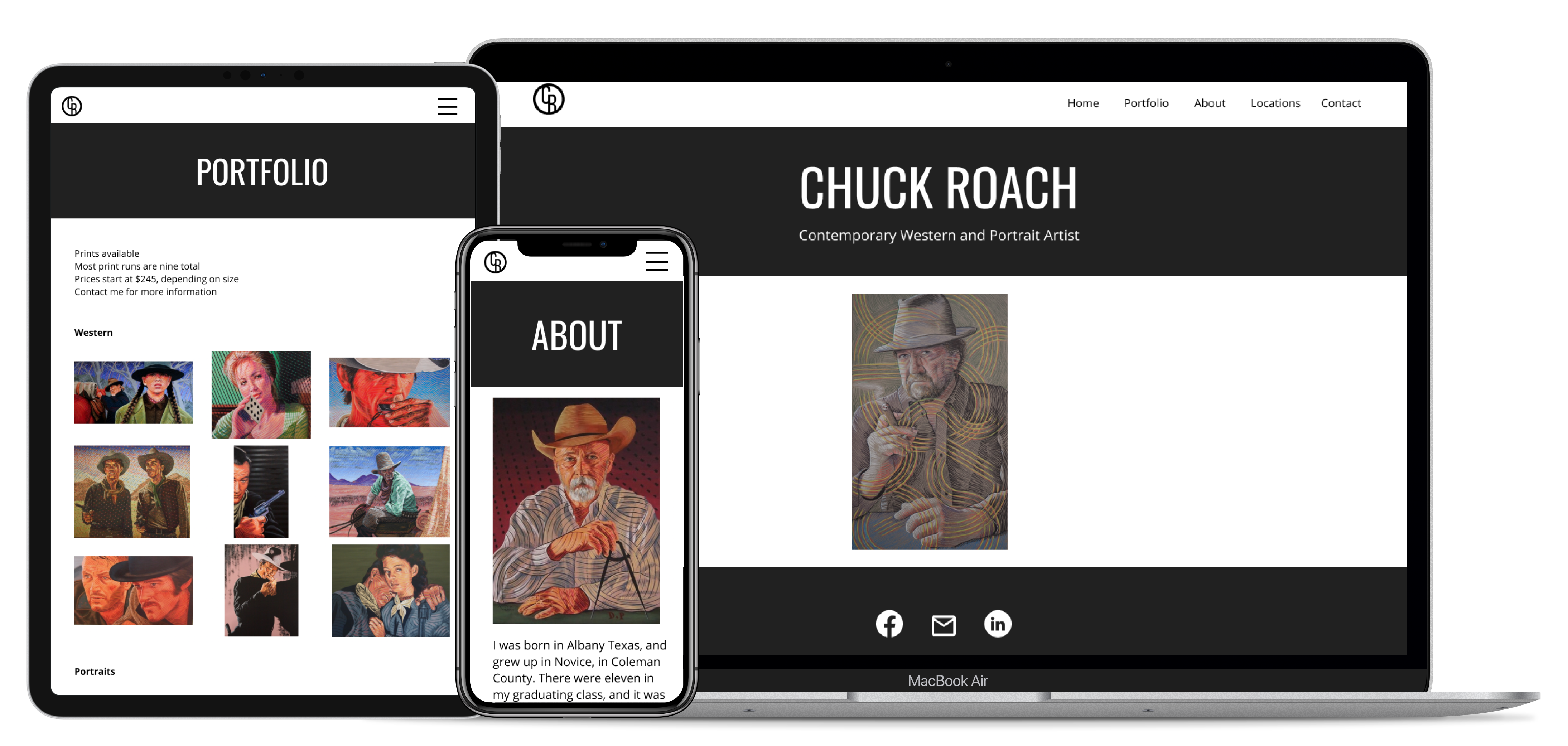
Chuck Roach is a contemporary western and portrait artist. His portfolio lacked a consistent design and was confusing to navigate. I created a clean, minimalist, and completely responsive design that allows the artwork to take center stage.

View live site


My role
▪️ Redesigned website
▪️ Updated site on Weebly
▪️ Designed new logo

Timeline
1 week - March 2021

Project type
freelance


pics of responsive website mockups

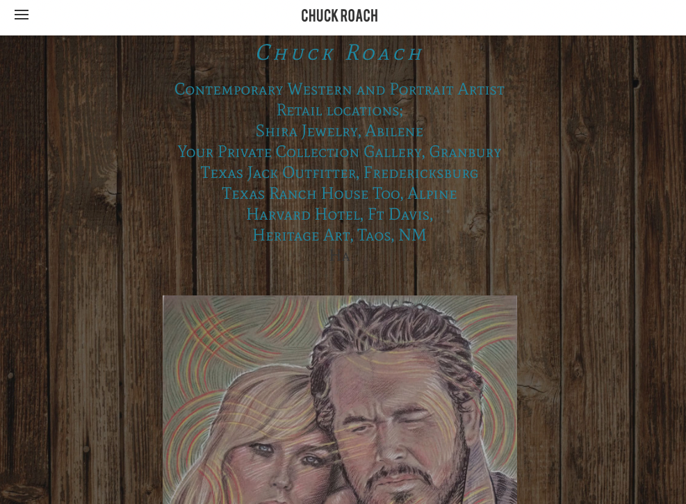
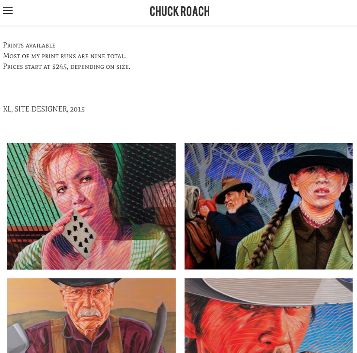
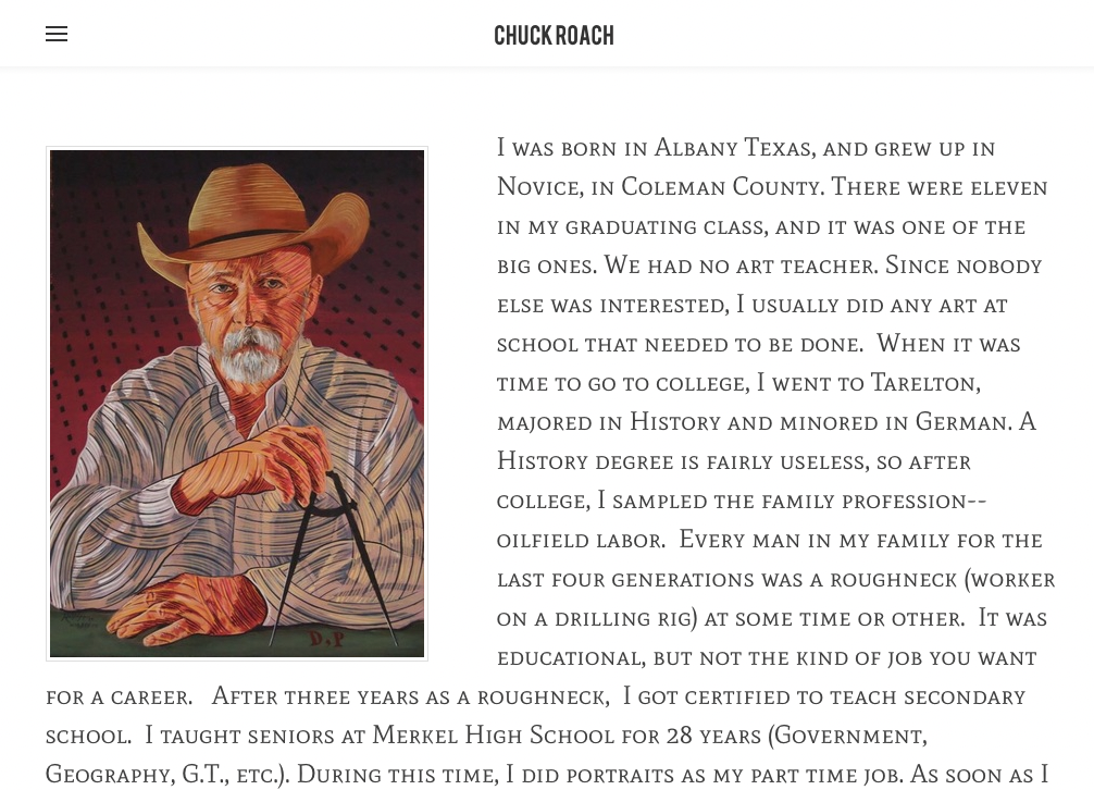
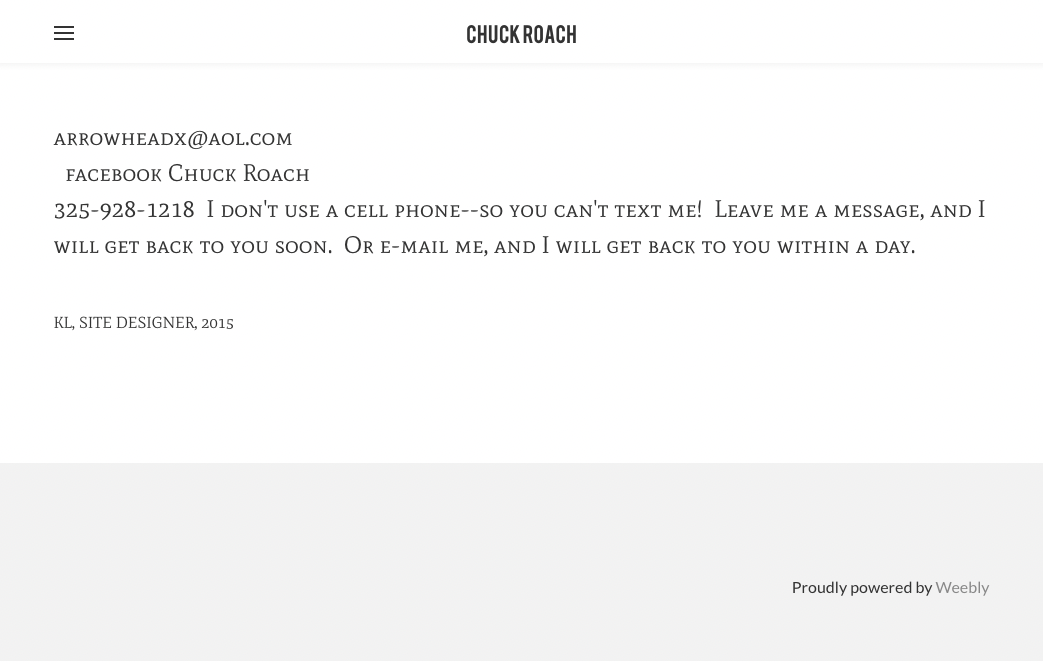
Before

  • The wood pattern on the homepage distracted the user from the artwork.
  • The all caps serif font used throughout the website and specifically the colour of the font on the homepage, made it difficult to read.
  • There were no links to the retail locations.
  • Because all of the portfolio images had been sized the same, many of the images were cut off. The images were not organized into categories making it difficult to find certain images and get a feel for the different types of work that Chuck does.
  • Chuck's contact page was not user friendly with no links to his social media or email.
before home page
before portfolio page
before about page
before contact page

After

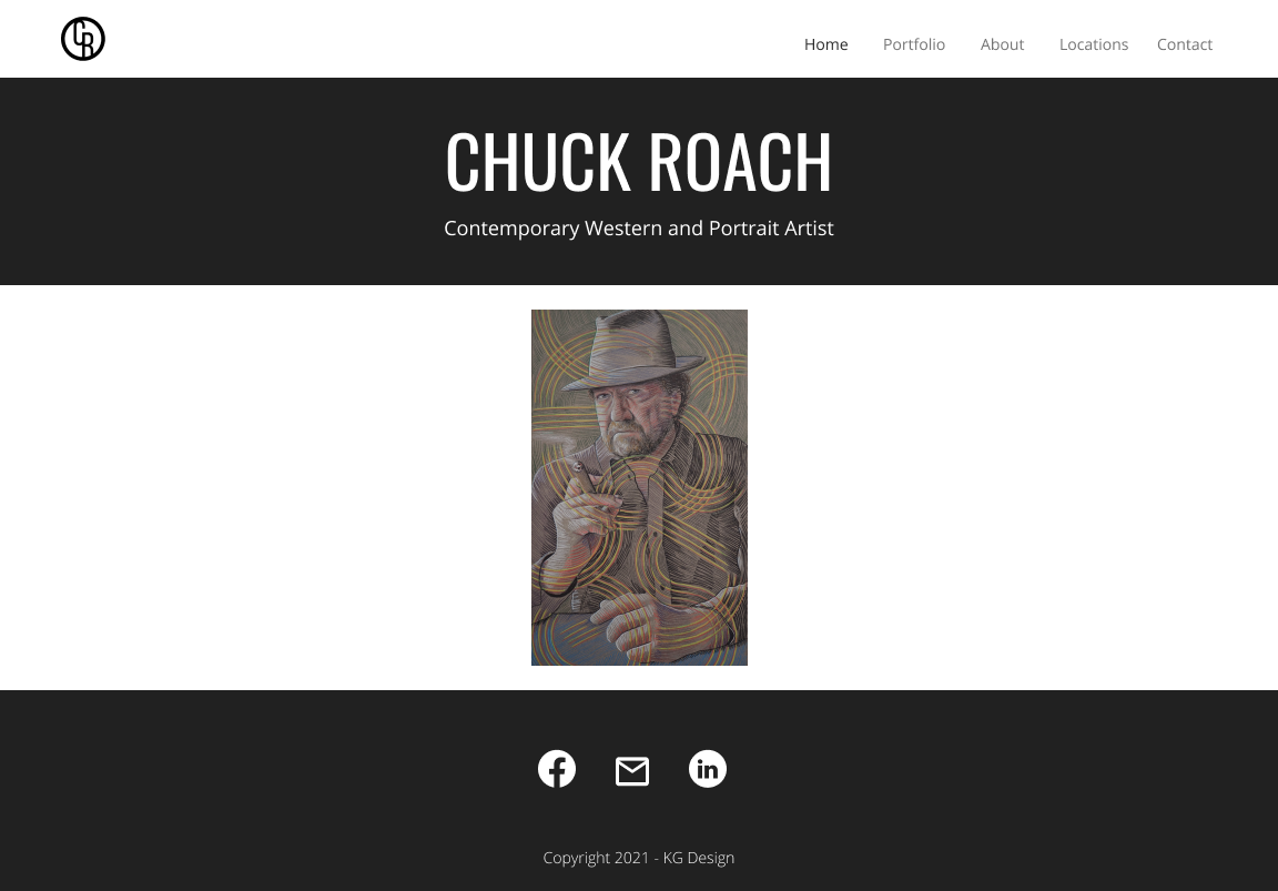
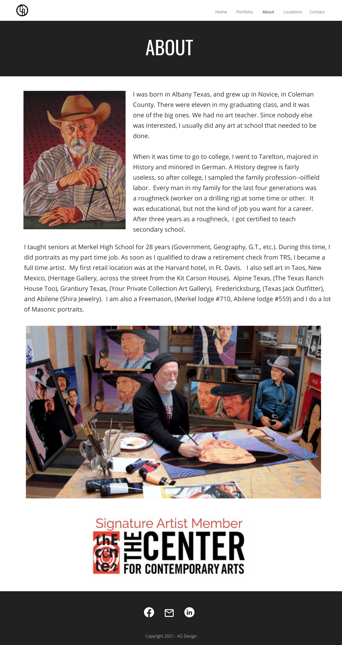
  • I chose a monotone colour palette to show off the artwork and kept the design consistent throughout the website. The navigation is clear and each page has a specific purpose.
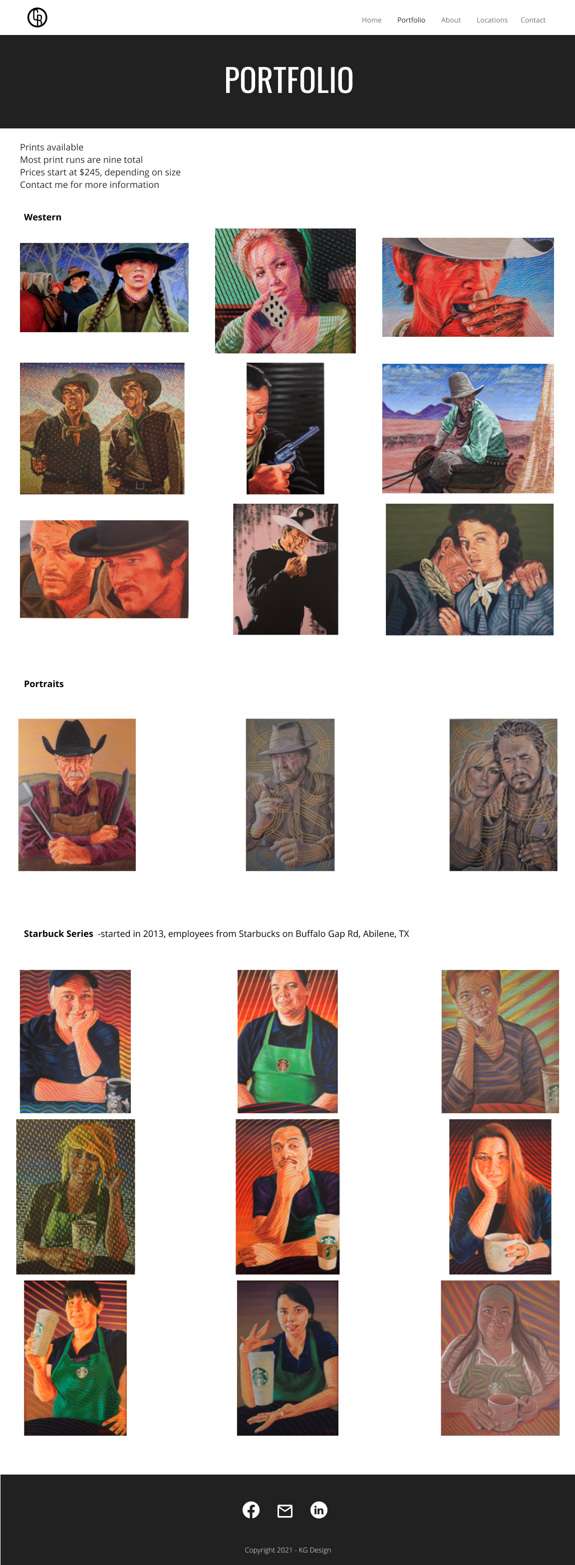
  • I changed the sizing of the portfolio images so that each image was fully visible. I also categorized the images by genre making them easier to navigate.
  • I changed the font throughout the site to open-sans to make it easier to read.
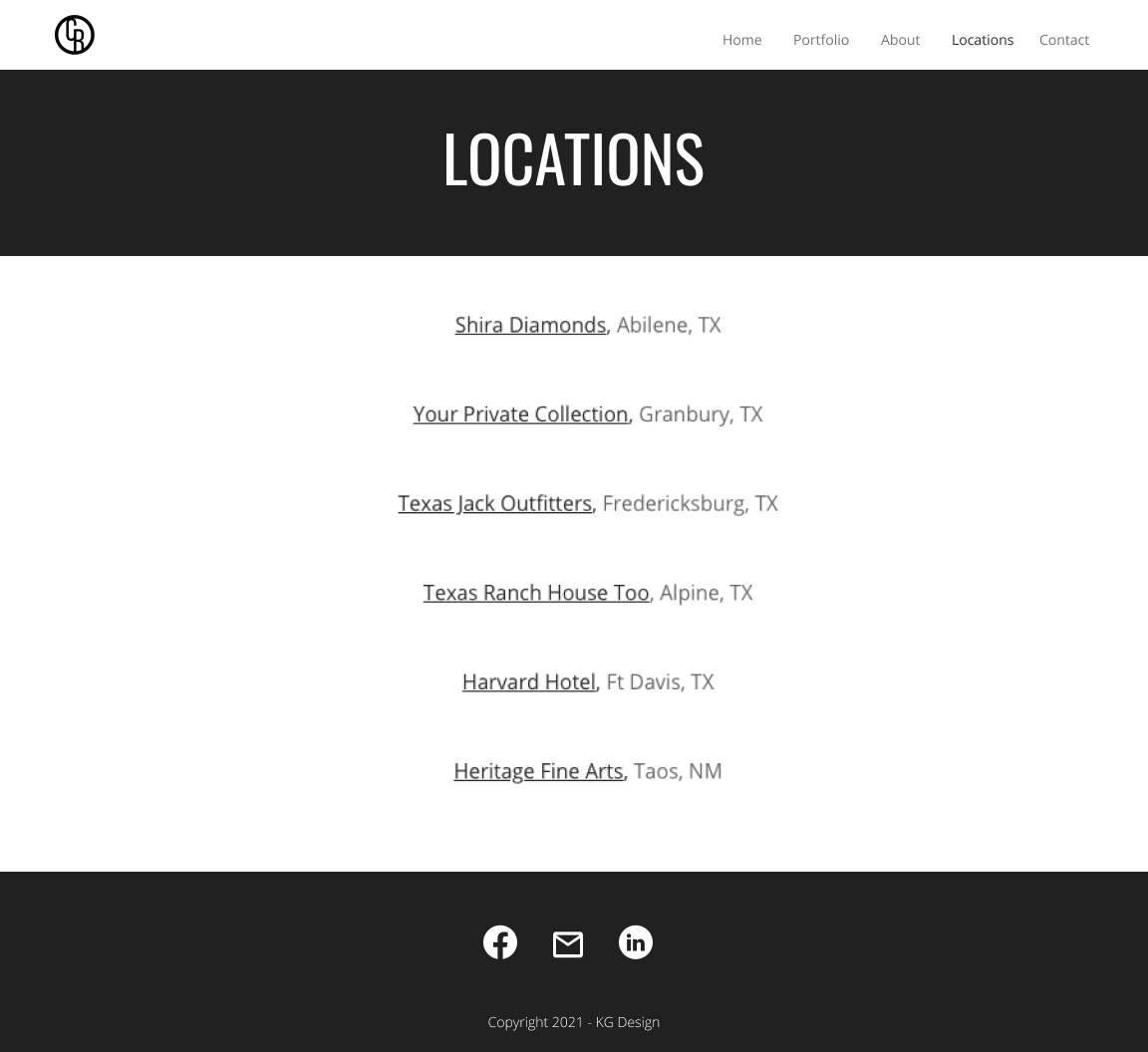
  • I created a new page with links to all of Chuck's retail locations making it easy to get information and find directions to the different galleries.
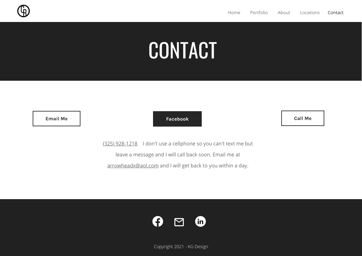
  • On the contact page I added buttons with links to call, email, and navigate to Chuck's Facebook page where he does most of his business.
after home page after about page
after portfolio page
after locations page
after contact page

New logo

Chuck did not have a logo. I decided to use his initials to make a logo in the style of a cattle brand to fit the western theme in his artwork.


Outcome

Chuck was not convinced that he needed to udpate his website. He does most of his business through his Facebook page so he didn't feel like the website was very important. One of his professional goals is to branch out internationally. I explained that his website would be integral to this step as he would be approaching new contacts rather than relying on word of mouth through Facebook. These new contacts would likely go to his website first and a clean professional website would make a great first impression. Chuck was very happy with the redesign and one month on he notified me that he had made two sales through website traffic.