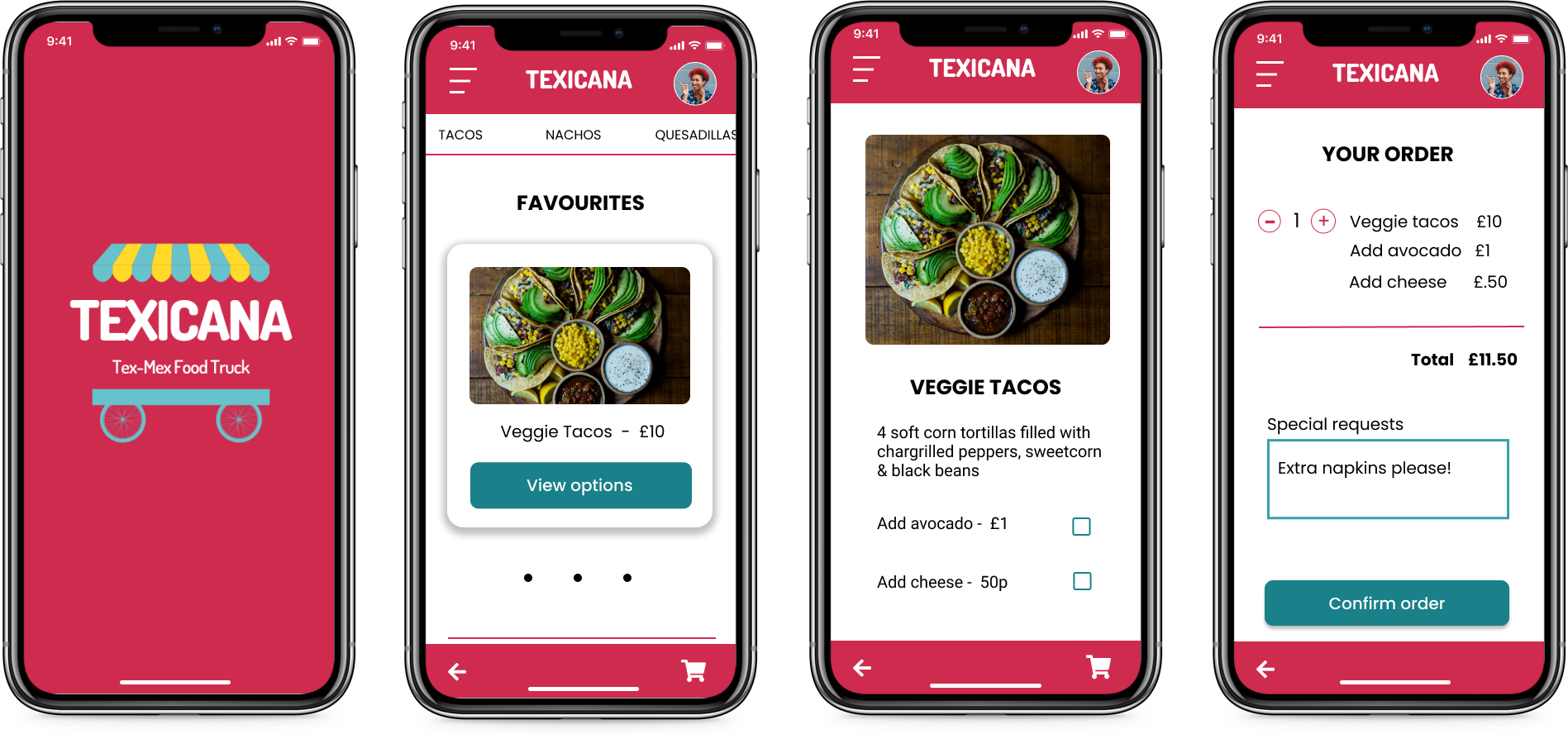
Maximising time with friends and family.
Texicana is a visual menu and ordering app for people visiting the food truck that automates the ordering process and reduces the need to queue allowing people to feel safe and spend more time together.
View prototype
My role
I was responsible for the entire design process:
Research, Wireframes, Protoypes, Visual Design, Testing
Timeline
6 weeks - April | May 2021
Project type
Concept

The pandemic has drastically changed consumer behavior. We are all much more likely to shop online and order takeaways from our phones. Some people are still hesitant to be in busy public places and no one wants to queue. How do we encourage people to get out and enjoy themselves again?
Create an app that allows people to feel safe and maximises social time by automating the ordering process.
I began by conducting interviews to confirm assumptions about consumer behavior changes. I used this information to create a persona which helped to keep the user front and center during the entire design process. I researched competitors who use ordering apps to find ideas and pain points before creating a storyboard, user journey and user flow. Then I created paper and digital wireframes. After round 1 testing with the low fidelity prototype, I created mockups and a high fidelity prototype for a second round of testing.
I conducted 5 interviews with individuals ranging in age from 20-65 who eat at a food truck or food market at least once a month. The interviews did confirm my hypothesis that the pandemic has changed customer attitudes to queues but it also revealed that the reason for this was less to do with social distancing and more to do with not wanting to miss out on precious time with friends and family. Participants also expressed the desire for a visual menu.
"I was at Peddler Market once and had to queue for 40 min. It was a nightmare. That would really annoy me now when all you want to do is spend time with the people you are out with."
"I wish I could see everything on the menu. I see what other people have sometimes and I'm like "I should have got that!"
I created the persona of Georgina to help me better understand the user for this project. She became my companion for the duration of the design process, helping me to see the project from her point of view.
Meet georgina...
"After being apart for so long, time with my friends and family is so important."
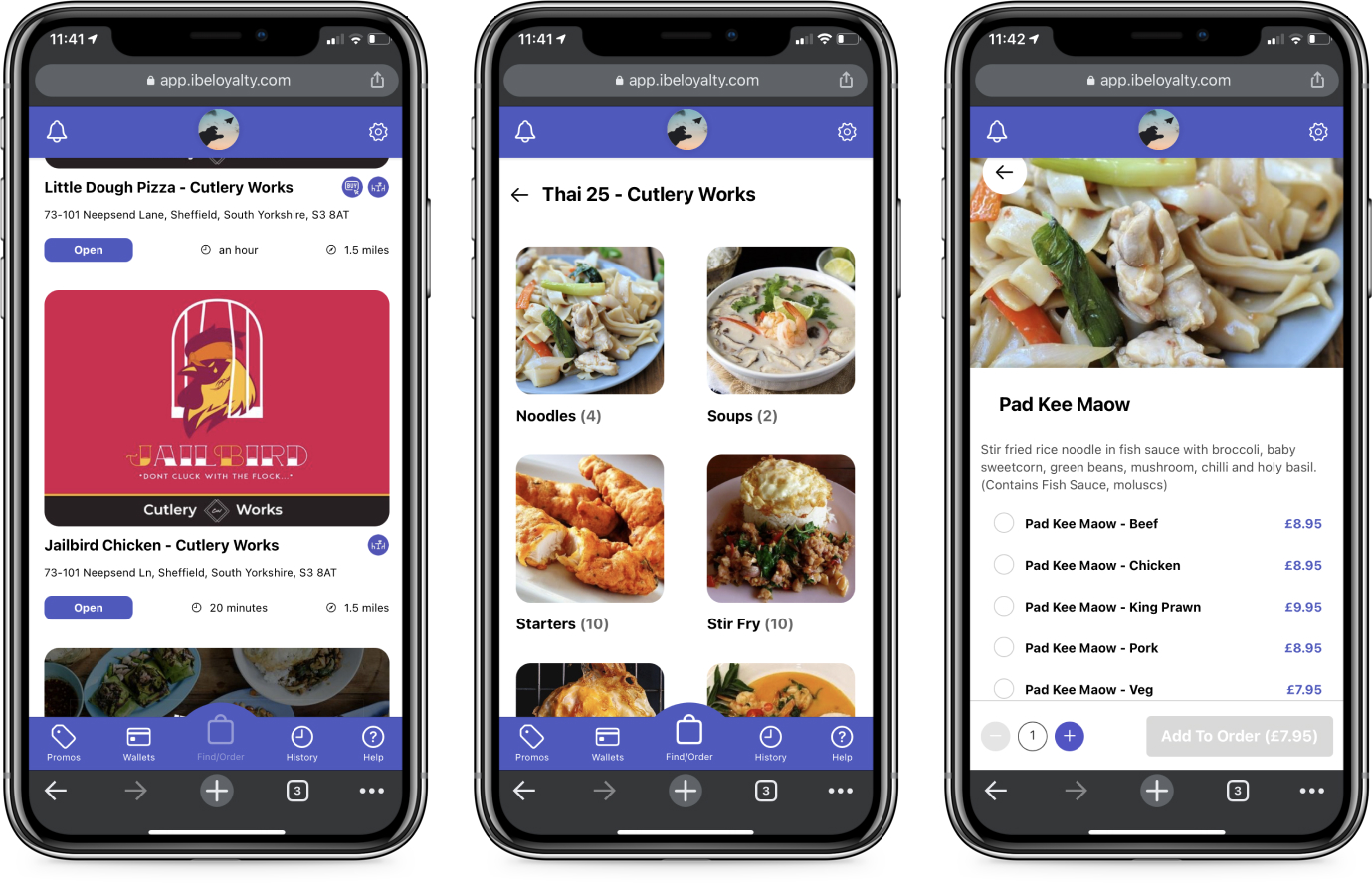
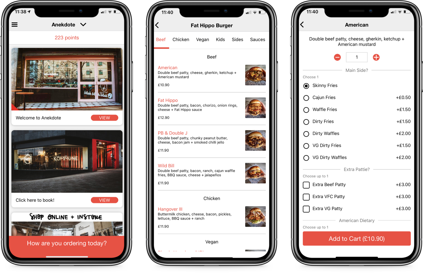
In order to gain insights from current products, I looked at apps from Cutlery Works and Kommune, two food halls in Sheffield, to generate ideas for user flows and find pain points that I could address in my design.
Cutlery Works
Kommune
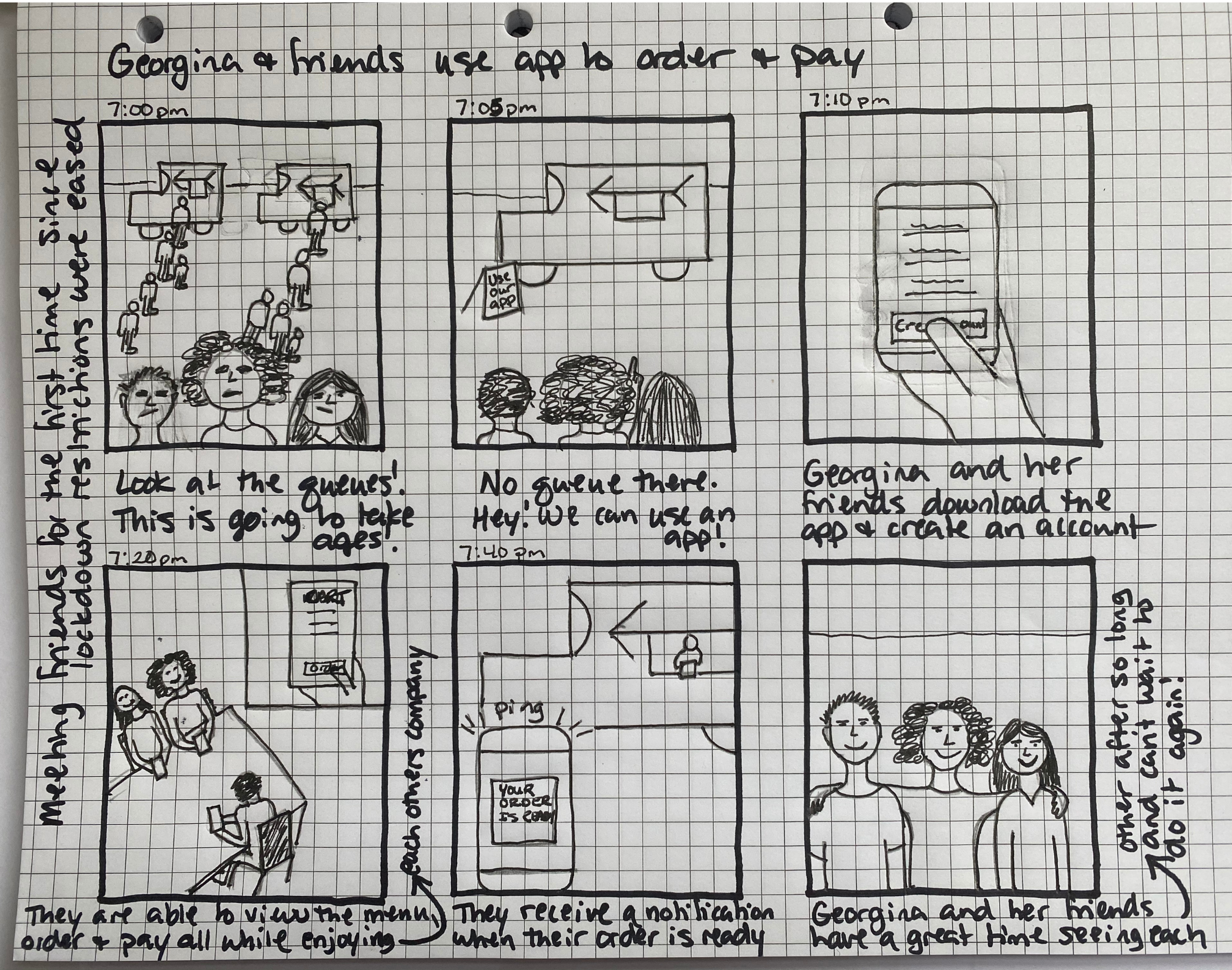
I created a storyboard so that I could explore a real situation in which the app would be used. Having a storyline to refer to helps me to ideate possible user flows and interactions within the app.
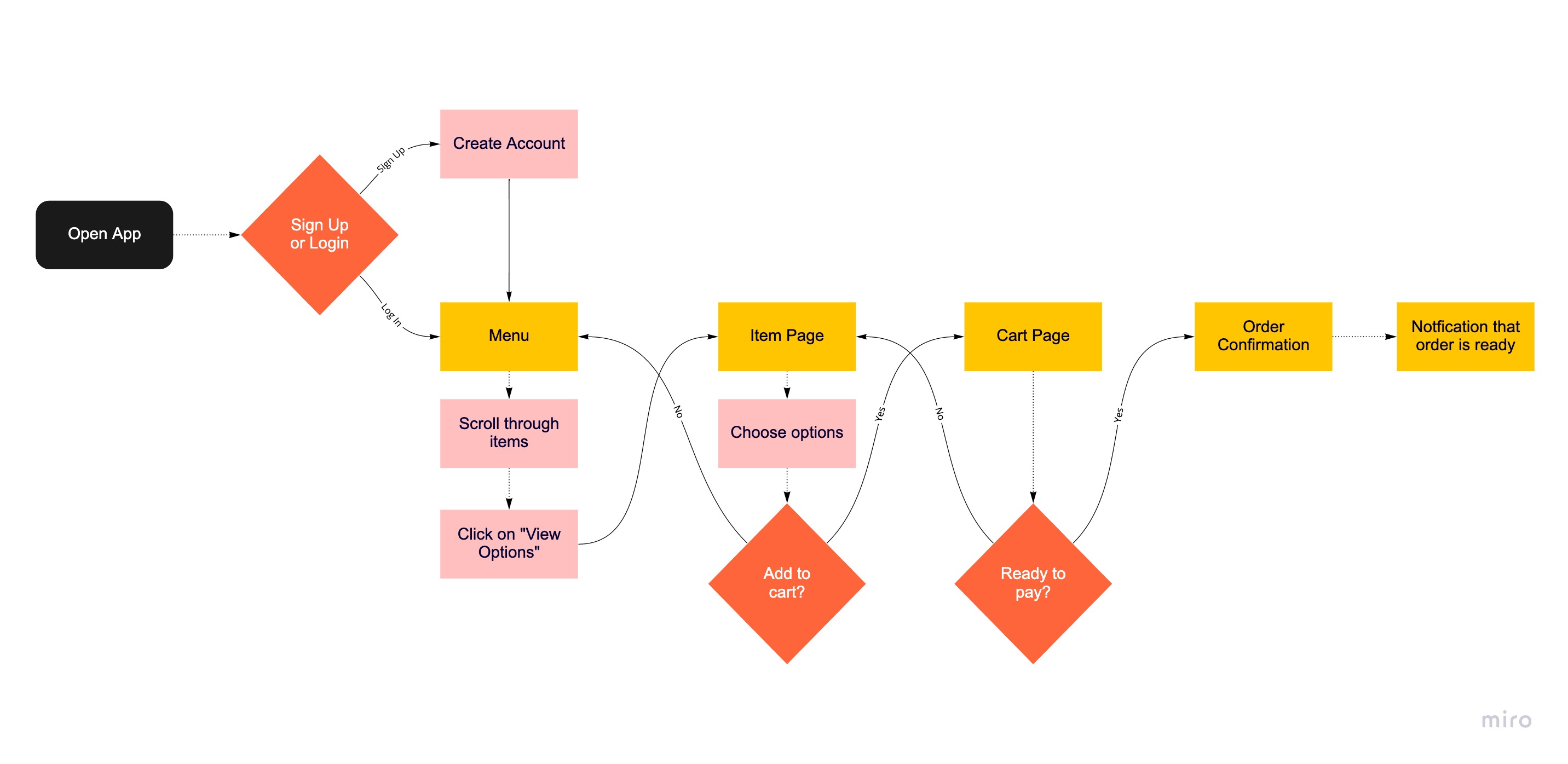
I created a user journey to look into the storyboard scenario in more detail. The user journey helped me to map out possible user flows and generate ideas for improvement opportunities.
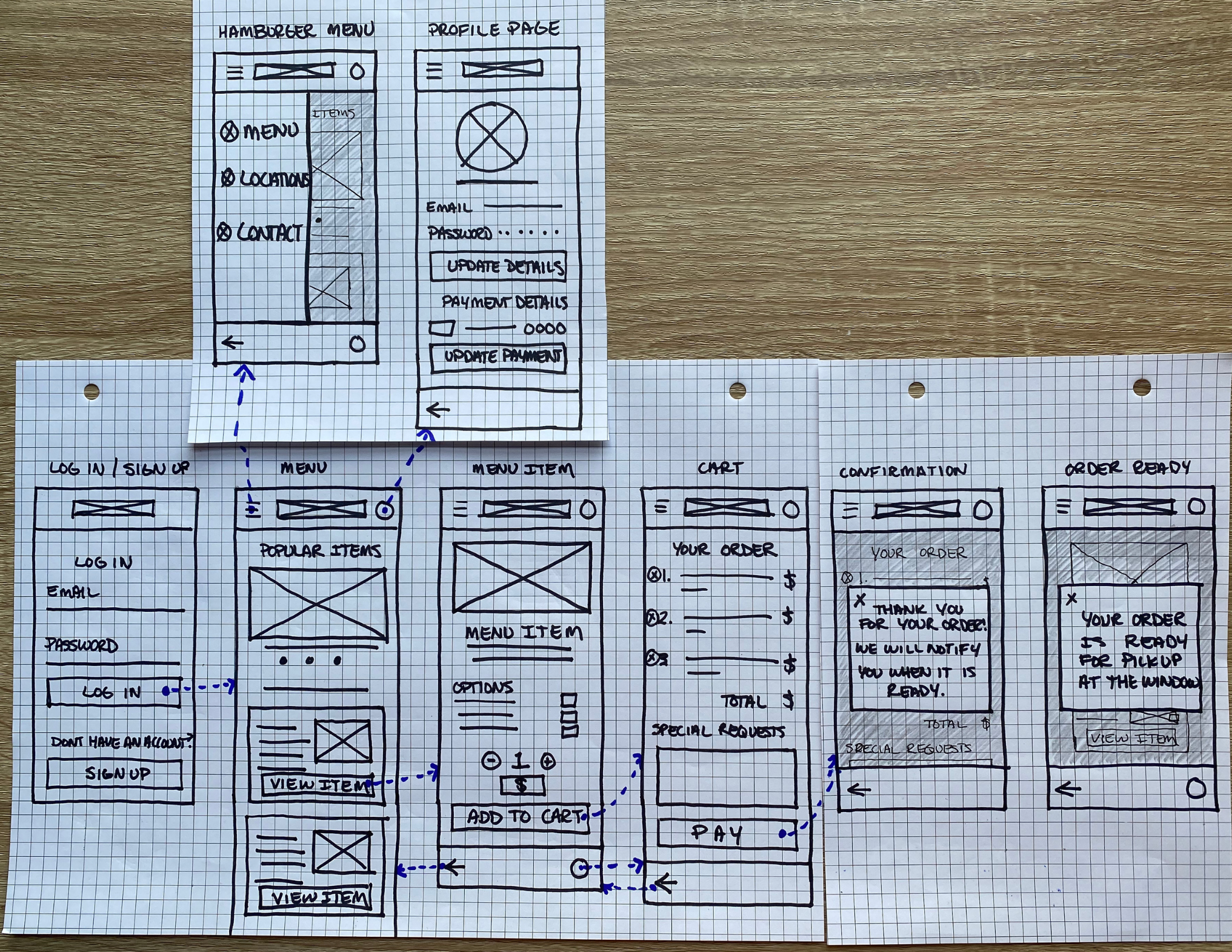
I ideated several versions of each wireframe before slotting them into the user flow.
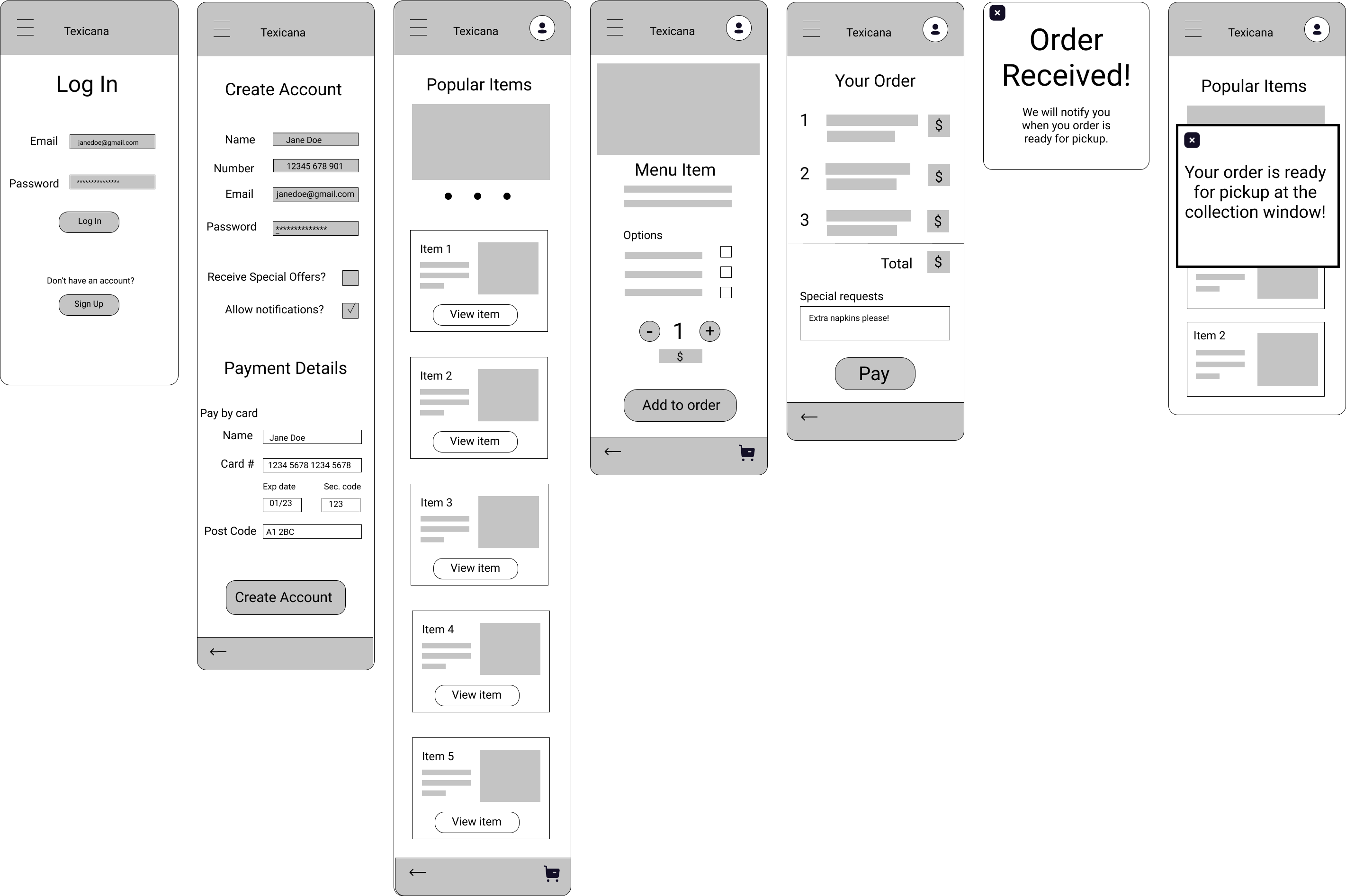
I created digital wireframes in Figma and then built a low-fidelity prototype for testing.
I conducted a moderated usability study with 5 participants (3 female, 2 male, ages 30-65) in order to find any pain points within the design.
Key insights
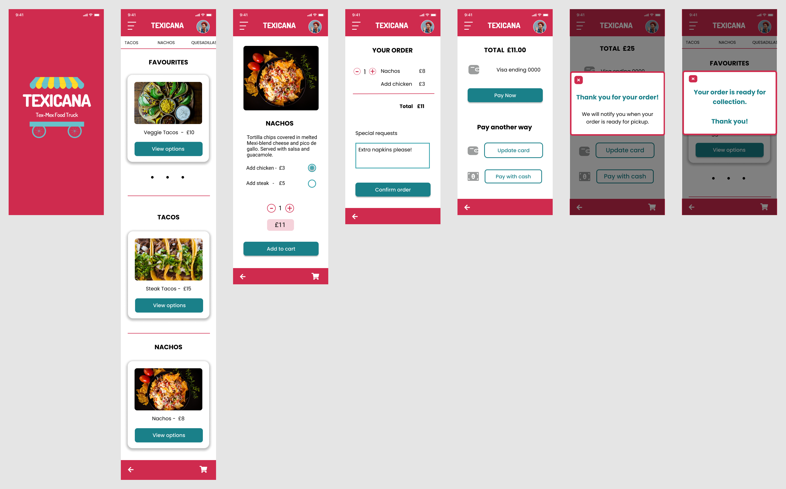
I used the mockups to build a dynamic high-fidelity prototype. I tried to make the ordering process feel as real as possible.
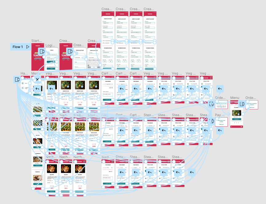
Research, research, research.
Research is the foundation of design. I could have backed up the findings from my interviews with surveys. In the future I will always spend more time on this step.
Solve real problems.
This ties back in with research. If I had chosen a real food truck instead of creating a concept business I could have looked at customer reviews to find more insights.
Don't forget about the user.
In the first round of ideation I made a note of the need for cash payments in my user journey but I forgot to include it in the prototype. This was a pain point during the first round of testing.