Return ticket

I worked with a UK national train company to
create clear return ticket options for their customers and prevent a major error within their ticket purchase journey.

train travelling down the track

🔒 Under a non-disclosure agreement
Some of the details in this case study may be vague to protect the client's intellectual property.
My role

  • Solo designer
  • Client facing

Services

  • Review of Usabilla/Sessioncam
  • Competitor review
  • Workshop facilitation
  • UI Design
  • Interaction Design
  • Developer collaboration

Deliverables

  • Discovery workshop
  • User flows
  • UI designs
  • High fidelity prototype
  • Documentation
  • Prototype video showing interactions and 5 scenarios

The brief

I was given a Trustpilot review revealing some issues with the user experience when booking a return ticket that combines peak and off peak times. I was asked to investigate all the possible problems when undertaking this customer journey, followed by suggestions on UX/UI improvements.

The review

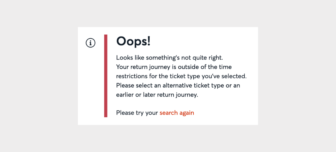
...when booking a return off peak on the website, it isn't immediately obvious what return trains are off peak and what aren't. You just get a schoolboy error message pop up. If you aren't familiar with the service, you are stuffed."

example of error message

The outcome

With thorough research of the problem and careful consideration of technical limitations I was able to design a solution that supported inline ticket type changes and also alerted customers if a cheaper ticket was available. I was able to do this without making any major changes to the current search results page design saving time and cost for the development team. The solution also supported the backend updates required to solve the problem on the app resulting in a seamless journey across both channels.


Understanding the problem

When does the error happen?
I spent a day reading through every related complaint made in the past 3 months and watching any linked SessionCam videos. The budget did not have room for any usability testing so this research helped to give me a clear understanding of when the error was occuring.

Why does the error happen?
Understanding why this error was occurring required extensive conversations with the company's tech team and developers. It was a major problem with their backend system and how it pulled through results for return tickets. The research I did helped the team understand the extent and serious implications of the problem.


Discovery workshop

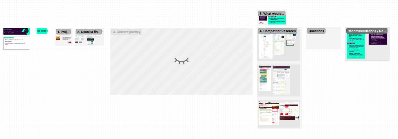
screenshot of figjam workshop

Bringing the problem to life

Rather than just describe the problem with screenshots, I started the workshop by showing the client actual footage from SessionCam of real customers struggling with the error and then trying to find information to recover from it. Then I read the Usabilla complaint that was connected to the footage. In doing this I shifted the focus away from "We are losing money." to "Wow. Our customers are really frustrated." This shift was extremely important. Rather than just improve the error message (the cheaper, easier option), the client was now on board with preventing the error altogether to create a truly better experience for their customers.

I am trying to book an off-peak return. This shows me a number of trains, but when I click on any of them, I get a message saying the ticket I have chosen isn't valid for that time. Why in the name of all that is holy are you telling me I can travel on any of these trains with this ticket? Why have you made it so bloody difficult?

-Frustrated customer


What are competitors doing?

I looked at several different competitors to see how they handled this issue. I used this data to facilitate a conversation about what was technically possible for the client and what limitations they had in terms of capabilities and cost.

The solutions could be split into two options:

Inline ticket type changes

  • ✅ Allows customers to choose any time for departure or return.
  • ✅ Shows customers the best possible price.
  • ✅ Alerts customers if there is a better ticket available.
  • 🔴 A similar solution for the client would require extensive design / development time.

Making unavailable fares inactive

  • ✅ Prevents errors in the purchase journey.
  • ✅ Has a similar design to the client's current design and would therefore require less development time.
  • 🔴 Doesn't provide clear information on why some fares are unavailable.
  • 🔴 Doesn't provide information on how to change the ticket type in order to choose an unavailable time.

Designing a human-centred solution

At this point, it would have been extremely beneficial to do usability testing on the client's purchase journey as well as Trainline and LNER. This would have helped me to understand any other pain points with the client's journey as well as any pain points with competitor solutions. Unfortunately, this was not within the scope of this project.

Instead, I used behavior witnessed on SessionCam and qualitative data from Usabilla to create the persona of Lena.

lena sitting at a table on her laptop with headphones on

Meet Lena...

Lena is a university student who needs to get to London for an interview.

She helped me to think about all the different ways in which she might browse and use the search results page so that I could ensure the solution covered every eventuality.


Bringing the solution to life

I designed a high fidelity prototype in Figma and created a prototype video with voiceover showing Lena's journey through different scenarios on the search results page.

The interaction design was complicated to explain in writing so the videos were an excellent supplement to the written documentation I provided for the design.

The videos were also used by the client in internal meetings to generate buy in for the engineering stage.

View prototype video

🔒 Under a non-disclosure agreement
This link will become active once I'm able to share it.


Thank you

Thank you for taking the time to view this case study.
If you would like to discuss further please get in touch!

email

linkedin