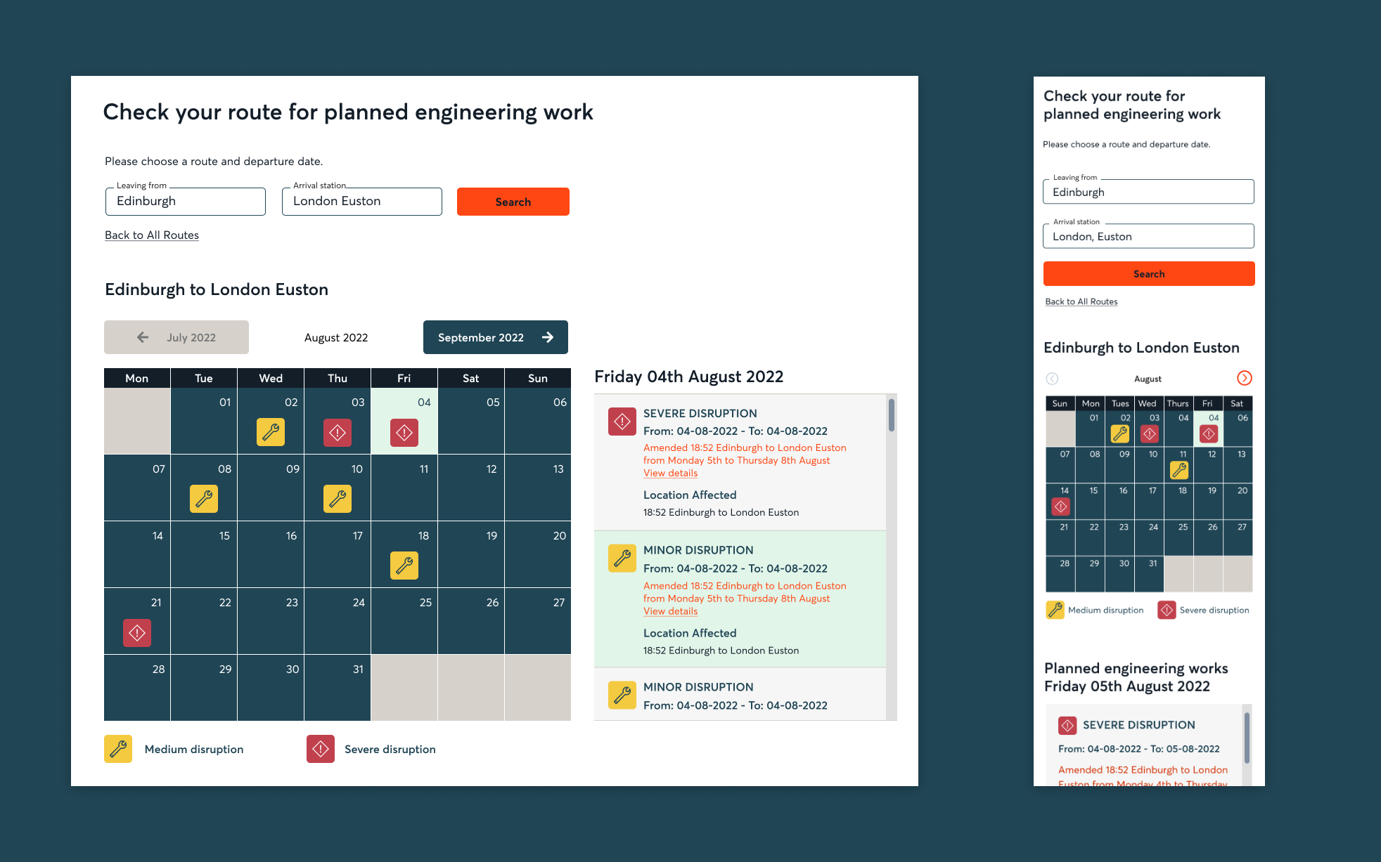
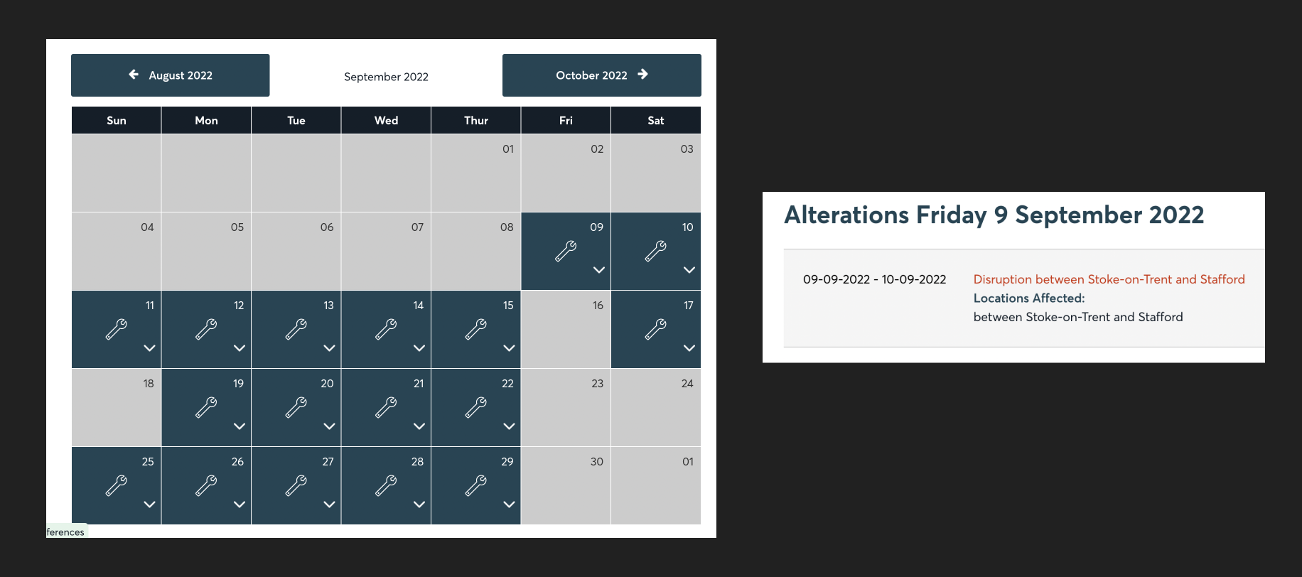
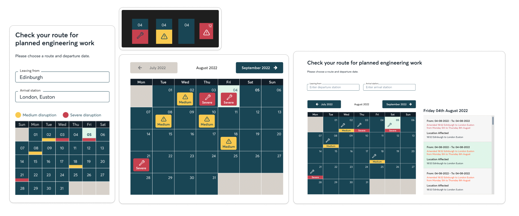
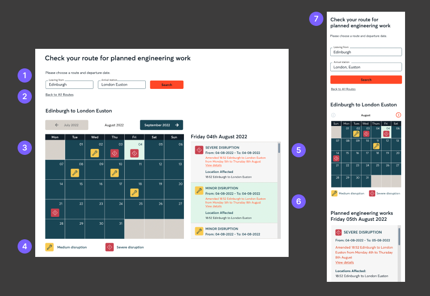
Engineering works

This was a UI design project to improve the planned engineering works calendar on the Avanti West Coast website. I implemented a traffic light system for disruption severity and added a search feature to enable people to filter by route.

final desktop and mobile design

My role

  • Solo designer
  • Client facing

Services

  • Competitor review
  • UX Audit
  • UI Design

Deliverables

  • User flow
  • High fidelity UI designs
  • Developer documentation

The brief

I was given a fairly open brief with the understanding that the information on the calendar needs to be more easily digestible with the ability to filter details for specific train routes. They also wanted quick visual cues for disruption severity.


The outcome

Through many iterations I was able to create a calendar that allows the customer to search their specific route for engineering works that could affect their journey. I also created an accessible traffic light system that allows the customer to quickly understand the disruption severity for the chosen day. This project is part of a larger project to create a “Travel Hub” which will include testing of this feature.


Understanding the problem

The first step was to do an audit of the current feature.

current engineering works calendar

Pros

  • ✅ Easily able to see which days are affected
  • ✅ Icon creates an accessible way to see affected days
  • ✅ Arrow makes it clear that you can view more information

Cons

  • 👎 No way to search for specific routes
  • 👎 No indication of severity
  • 👎 Feels very overwhelming as it shows works for the entire network
  • 👎 Allows the user to go back to past months which is unnecessary and could cause confusion
  • 👎 There is no indicator on the details section that you can click on it to view more information

What are competitors doing?

Out of all of the competitors that I reviewed, no one allowed for filtering for specific journeys, something that can definitely be improved upon. Several competitors only listed engineering works in date order and did not provide a calendar. The two calendars that I did find used the same design and gave no indication of severity.

screenshots from competitors

Design exploration

This is a small selection of design ideations for the calendar. The most challenging aspect of the design was creating a traffic light system that was simple to understand and accessible (using icons to supplement colour).

ideations of calendar designs

Final designs

Through continuous feedback from the team and the client, we were able to align on this final design for the calendar.

final designs
  1. I added a search feature to filter for specific journeys.
  2. I provided the ability to go back to the default calendar with information for the entire network.
  3. I created an accessible traffic light system for severity.
  4. We made it accessible by adding a separate icon for each severity and providing a key at the bottom of the calendar.
  5. I carried the severity icons through to the details section to give each detail more context.
  6. I added a text link for “View more details” to ensure understanding that this is a link for more information.
  7. I made sure that the desktop design could carry through to the mobile design.

Next steps

This project is part of a larger project to create a “Travel Hub” which will be a redesign of Avanti’s travel information page and will be a one-stop shop for journey information. As part of this project we will be doing research into user needs for this page as well as testing the engineering works calendar followed by any iterations necessary.


Thank you

Thank you for taking the time to view this case study.
If you would like to discuss further please get in touch!

email

linkedin